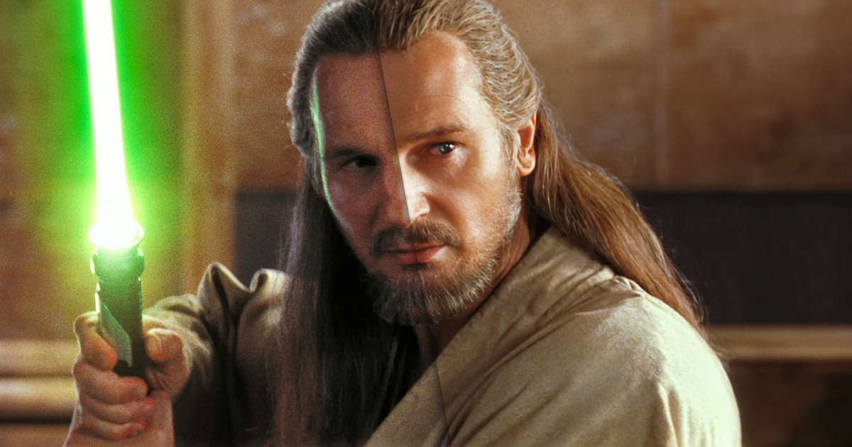

Star Wars: The Phantom Menace recently returned to theaters to celebrate its 25th anniversary, and while it was a real treat to see the first prequel movie on the big screen once again, some fans have brought up how different the film looks from its original release.
Of course, Star Wars fans are accustomed to the many changes the movies have undergone over the decades, and The Phantom Menace has not escaped unscathed. Throughout its history on DVD, Blu-ray, and 4K Ultra HD, we’ve seen the addition of new scenes, altered dialogue, and the replacement of puppet Yoda with a CG version, but perhaps the most divisive change actually affects the entire movie — a very liberal application of DNR (digital noise reduction).
The use of DNR has been controversial, notably in the recent releases of James Cameron’s True Lies and Aliens, but many people don’t see a problem with it. Most modern movies typically look slick and crystal clear with little to no film grain, but the 25th-anniversary screenings of The Phantom Menace have prompted some debate over what the film is supposed to look like. If you scroll through X/Twitter, you’ll find plenty of fans who were overjoyed to see the film in theaters, while others have commented that what was screened looked blurry and overly smooth, making them more aware of the CG characters.
It’s important to note that The Phantom Menace was shot on 35mm film. Although George Lucas had wanted to shoot it digitally, he wouldn’t get the chance to do that until Attack of the Clones. From what I remember, The Phantom Menace‘s original 35mm print was gorgeous, with subtle grain and a real warmth that helped meld the live-action footage with the CG elements. Once the movie was released on Blu-ray, fans noticed that all that grain had been scrubbed from the image, resulting in a smooth digital appearance that brought it more in line with Attack of the Clones and Revenge of the Sith.
You can check out two comparisons between the home media remaster and the 35mm print below.
yes!! it's especially rough on the texture of the 3d stuff, which suddenly looks way too soft and plastic-like. pic.twitter.com/mFR8iqMcCB
— Jón – making Tiny Tires
Wishlist now! (@jonkristinsson) May 8, 2024
What was in theaters then vs. what is in theaters now. pic.twitter.com/DdW7weEOga
— Brandon Bird (@Brandon_Bird) May 8, 2024
I’m admittedly a lover of film grain, so I’m probably biased, but to my eye, the 35mm print looks infinitely better than the overly smoothed remaster. I believe those Battle Droids are really there; I believe Qui-Gon Jinn is holding Jar Jar’s tongue. There’s something inherently more… organic about it. You can check out more screencaps from the 35mm print of The Phantom Menace on X/Twitter and bring back those memories of sitting in the theater in 1999.
Did you catch the 25th-anniversary screening of The Phantom Menace in theaters? Which look of the film do you prefer?
The post Star Wars: The Phantom Menace 25th anniversary screening prompts debate over how the film is supposed to look appeared first on JoBlo.

Leave a Reply