A new exhibition dedicated to Jean-Luc Godard’s last work highlights his artistry and focuses on how the influential French filmmaker implemented a haptic approach not only to filmmaking but the entire creative process. Scénarios, his very last short film, completed a day before his assisted death, is a visual collage accompanied by an actual notebook that shows Godard’s way of thinking. A mix of images, painting and writing gives us an exclusive look into the mind of one of the most innovative and experimental directors ever, who shaped an aesthetic that would influence filmmakers and artists for generations to come.
His fearless kamikaze way of creating films meant that he would write scripts on set practically from scratch, in between takes. Not a great believer in preparation, his motto was “Seeing precedes the written word”, so much so that he drew parallels with fine art and contemporary design throughout his films. The run through the Louvre in Bande à Part can be understood as a depiction of the way he absorbed and utilised inspiration that came from the world of fine art.
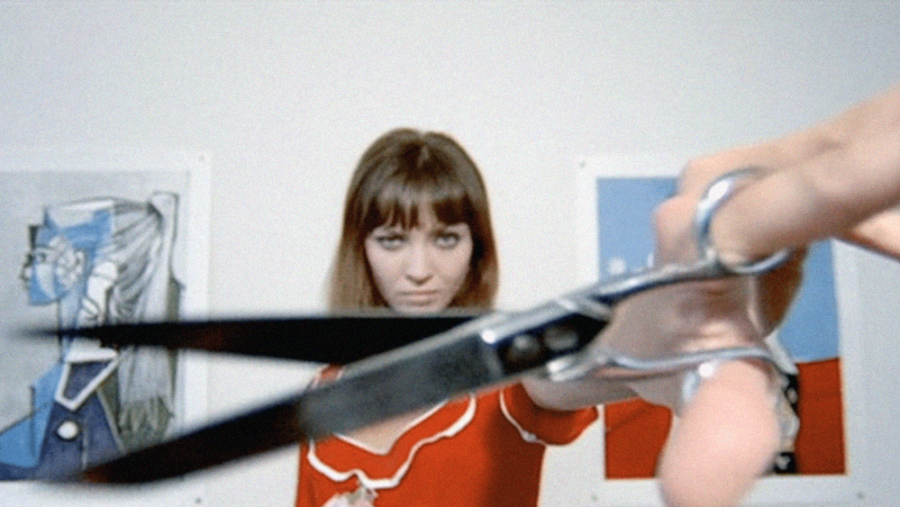
In Pierrot le Fou, eclectic collages of “industrialised” artworks by Picasso, Modigliani, Chagall, Renoir and others appear in the form of posters and postcards taped on the walls, juxtaposed with bold red magazine covers of Paris Match. A celebration of post-modernism but also a cultural observation on the relationship art has with mass reproduction. By using postcards of the greatest works of art, and ripped out magazine covers, the wall becomes ever-changing and alive. This constant movement is also true of the protagonists who are on the run across the country from the police. When they get to relax in a bathtub, they are seen to be avid readers of Elie Faure’s History of art. Pierrot’s blue painted face can be seen as a then contemporary reference to Yves Klein and his iconic blue as Pierrot vanishes into the blue sea and sky. But Godard goes a step further: By positioning the profile of his creation, Jean-Paul Belmondo and Anna Karina, in the midst of two Picasso portraits, he seems to issue a statement: If Picasso is the greatest painter, then Godard is the greatest filmmaker.

Where other French filmmakers such as Éric Rohmer were strongly inspired by classic literature, Godard’s interests span philosophy, painting, music, design, advertising and the consumerist, visual world we live in. Despite the ever occurring references of modern art and advertising, typography seems to be the thread that ties it all together and became a focal point in his work. The tension between text and image and the use of specific fonts went beyond creating a layout; it became a reflection of both his musings on zeitgeist and his dual Swiss-French origin.
His typographic choices can be divided into multiple parts, as observed by Paule Palacios Dalens. Films like Pierrot Le Fou, La Chinoise, Weekend, Masculin, Féminin and Weekend were marked by the French font Antique Olive, designed by Roger Excoffon and released in 1960. Not only was it a very contemporary choice but also one that is strongly entwined with a typically French aesthetic. The dot on the capital ‘I’ was possibly custom-made by Godard and added playfulness to a lively font that also possibly has its counterpart in the British Gill Sans. Except for the black and white Masculin, Féminin, each film makes clear that it is a French font by utilising the flag’s emblematic tricolour, which gives a strong sense of belonging and socio-political affiliation. Particularly 2 or 3 Things I Know About Her looks critically at the consumerist world we live in. Godard even lines up multiple items such as cigarettes, toothpaste, washing powder and cereals in the shape of a flat lay, pretty much predicting today’s consumerist Instagram aesthetic. In no other Godard film does he highlight the bombardment of advertising as dramatically and hopelessly as he does here. Large billboards in bold type on colour blocks, contrast the whispering off voice, it is all too powerless against corporate entities. Individuals seem small and irrelevant, almost disappearing into its busy backdrop of messages. This is a favoured frame of his, which he uses in the same manner in other films. In A Woman Is A Woman, whenever Angela leaves her domestic enclave, she is surrounded by advertising, as is Nana in My Life To Live, the farmers in Weekend and the youth in Masculin, Féminin.
The films using Antique Olive are in contrast to those displaying the Helvetica. Films like Alphaville, Keep Your Right Up and Film Socialisme display the Swiss font because its usage was a thematic reflection and one of the modern age. Helvetica remains one of the most widely used fonts in the world. It is often considered a safe option and to this day still praised in design schools which ensures its continuum.
It has swept over contemporary culture and its imprint on logo design is overwhelming; the New York subway, American Airlines, Panasonic, Lufthansa, and many other tech and transport companies use the font due to its powerful properties of modernity, progress and pragmatism. Magazines use it paired with fashion for a cool retro look and to signal they are young and ahead of the curve. It becomes clear why Helvetica was used for his dystopian Alphaville instead of the French Antique Olive. By using Helvetica, he purposefully swaps the red, blue and white palette to replace it with a more sombre black, white and grey. The films become more experimental musing on politics as opposed to the provocative expressiveness that is present in a film such as La Chinoise, but now they contain the cold soberness and distance of a neutral country that is his other half, Switzerland. It’s a font that remains devoid of personality and accentuates the tone of the meditation on human values by Anna Karina in Alphaville, when she wonders what the word “conscience” means. A topic that cannot withstand the tricolour Antique Olive.
The typographic choices that Godard made were thematic and not only chosen for their stylistic properties. It is for this same reason that the off voices are so distorted in Alphaville and hushed in 2 or 3 Things I Know About Her. Godard said he was a “painter with letters”, perhaps Scénario(s) can help us discover how all encompassing his perception of moving image really was so we can reflect about it, possibly in our own handwriting.
Scénario(s) runs from the 14 – 22 December with accompanying film programme at The Institute of Contemporary Arts (ICA)
The post Inside the design world of Jean-Luc Godard appeared first on Little White Lies.
Leave a Reply